Visualizing U.S. State Legislature Partisanship
A seemingly simple question with a fun, but complex solution.
For a research paper I worked on with peers in the UChicago Econ/Data Science major, we wanted to analyze the correlation between flips in state legislatures (following Congressional / Governorship elections) and the average income in that state controlling for industry and education level.
In simpler terms, do changes in your local government have a real impact on your income? Politicians often campaign on bringing more jobs to their economy, but how do wages fare?
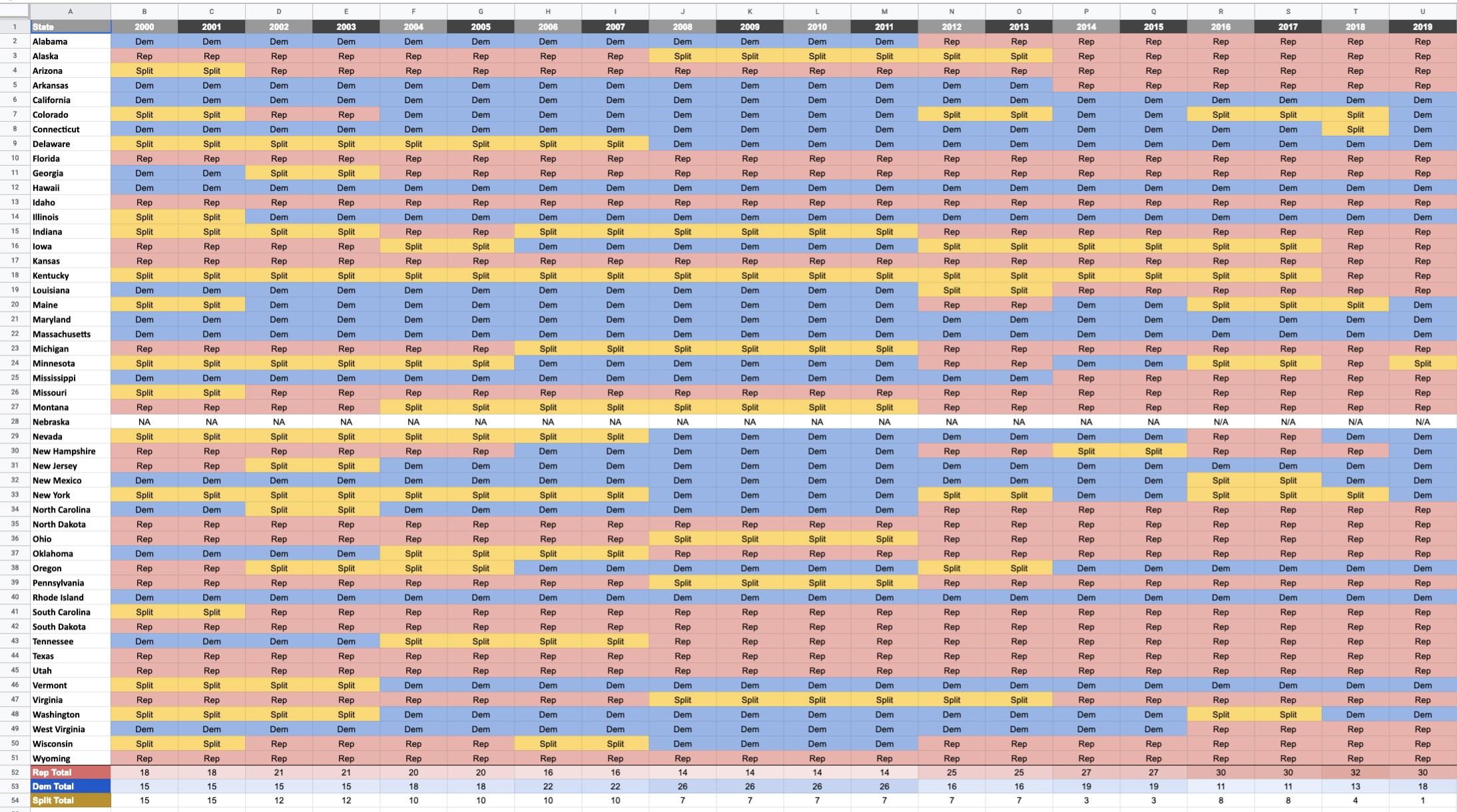
Part of the difficulty with something like this is visualizing the data on a map. Here’s what it looks like tabulated:
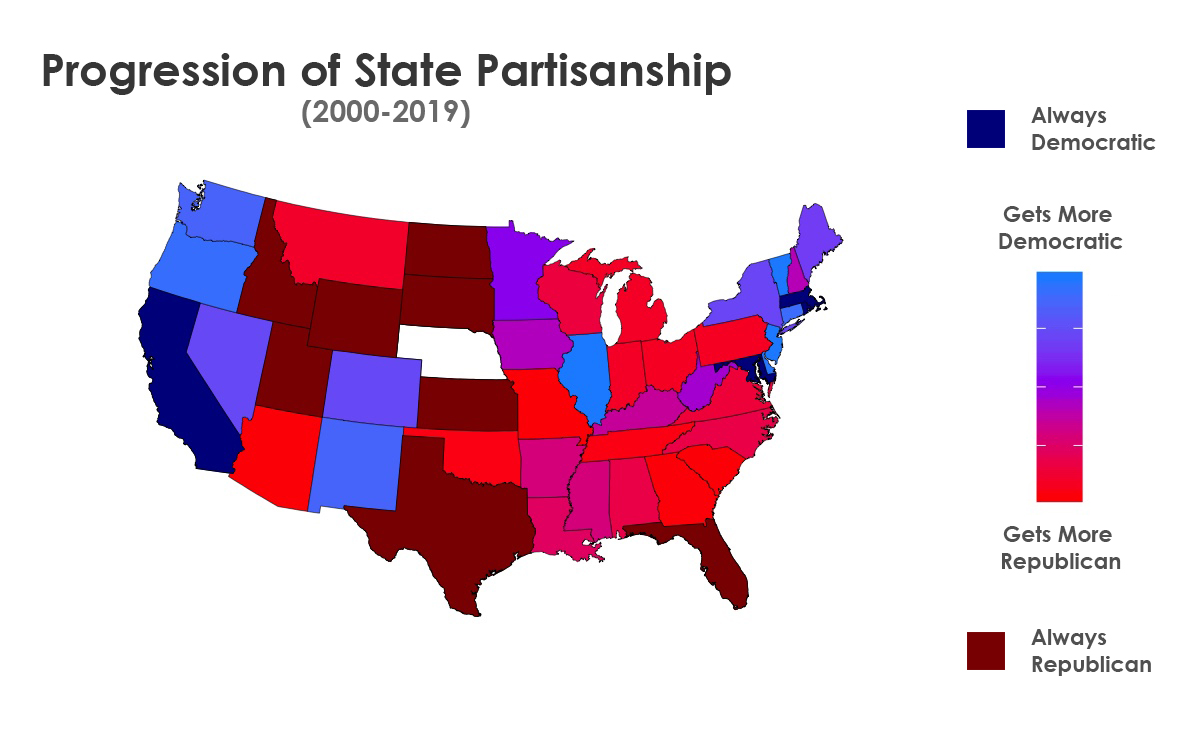
I started with weighting each year using a power formula to give greater weight to the most recent years (indicating how a state has progressed). 2000 became year 0, 2001 became year 1, and so on and so forth until 2019 (year 19). Then, I raised that number to the power of 2.5. This gives us increasingly big numbers as we progress down the line! Then we can multiply each of these values by the composition of the state legislature: -1 for Republican, 0 for Split, and +1 for Democratic. Summing the result, we get a weighted number that tells us how the state has progressed over time.
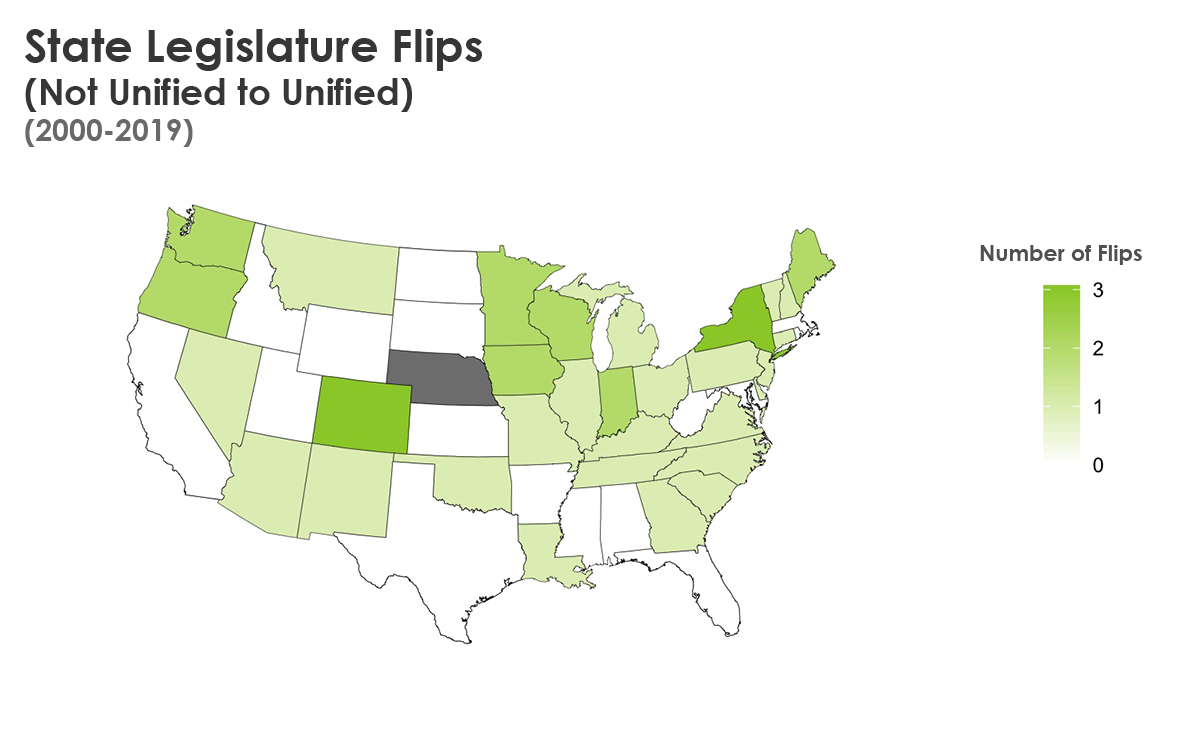
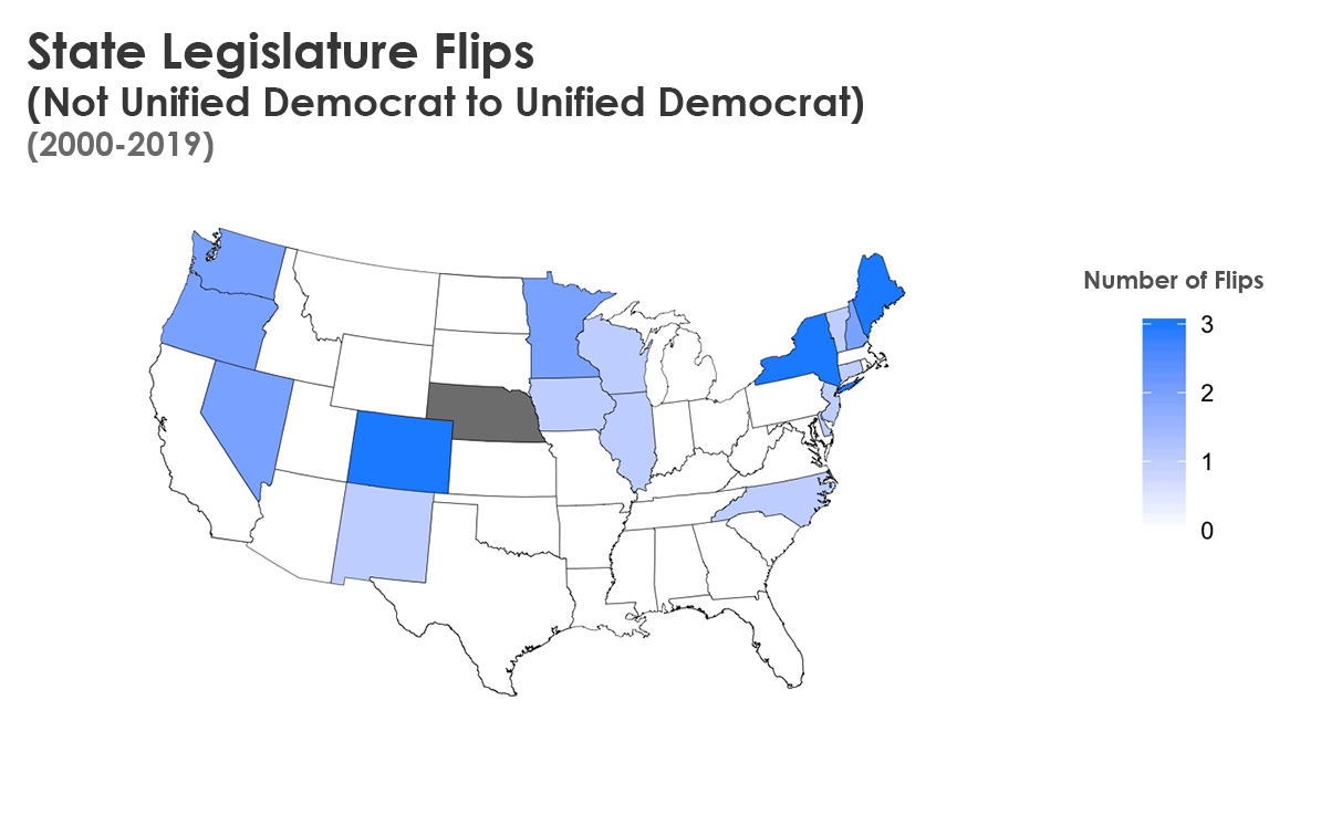
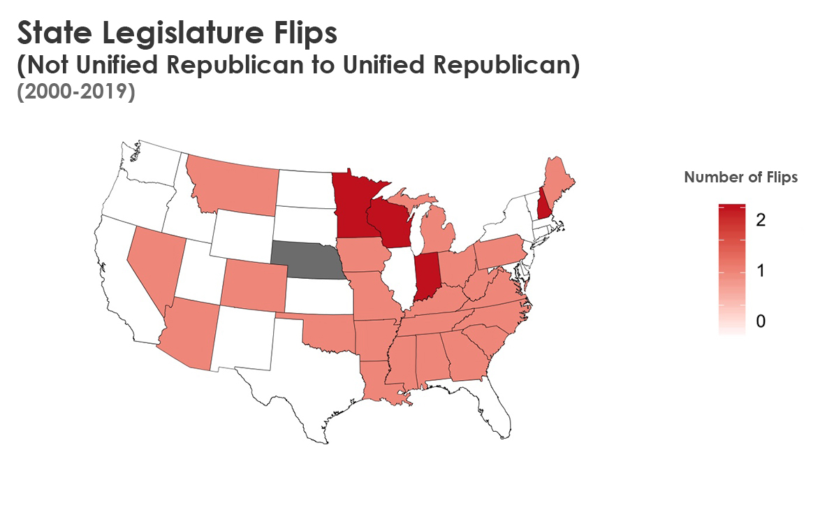
I created a dummy variable to check if a state’s legislature always belonged to one party–these states are darkly colored correspondingly. Everything else (except Nebraska) is placed on a gradient scale where the aforementioned weights determine political party progression. The graph clearly depicts which states have remained the same since 2000, and the party movement of the other states.
Here’s what the final visual looked like when we merged the data!
Conclusion
Ultimately we did not find a meaningful correlation between party flips in state legislatures and wages for that state’s constituents. It is interesting though in the visualization to see the U.S. becoming increasingly polarizeed, with a much redder South and Midwest and a much bluer West and Northeast. It’s also curious to see traditional Presidential election “swing states” like Florida as starkly Republican at the state legislature level, but this is indeed supported by the data and suggests lower down-ballot voter participation.
This project forced me to learn more about R and good data visualization. I can check that my results are correct by just overlaying the two right graphs below. Thus we have visualized a LOT of geographically diverse data in an easily digestible way. And our data makes intuitive sense when cross-referencing our tabulated data.